
Hi, I'm Bre!
My work lives at the intersection of story, strategy, and community. Every project I take on is rooted in a simple belief: real change begins with honest connection, and honest connection begins with a well-told story.
Here’s What I Do
My work spans brand, storytelling, and digital experience, always focused on care, collaboration, and purpose.
Branding & Visual Identity
I create thoughtful visual identities for healing practitioners, queer and trans-affirming businesses, musicians, and mission-driven organizations. My work often includes logo design, visual systems, and supporting materials that help brands feel grounded, expressive, and human.
Editorial & Storytelling
Through writing, interviews, and multimedia storytelling, I help organizations share meaningful stories about people, place, and purpose. This includes editorial writing, long-form projects, and documentary-style work.
UX & Digital Experience
I design user-centered digital experiences that translate complex ideas into clear, engaging tools. My approach is grounded in collaboration, accessibility, and thoughtful design decisions.
Ways We Can Work Together
Choosing someone to bring your ideas to life is a very important decision. I am proud to support amazing businesses and individuals with the creation of intentional design and storytelling. Let’s see what we can do!
About Me
I’m a multidisciplinary designer and writer. I’d love to tell you more about my experiences and education might make me a good fit to work with you!

Branding & Visual Identity
Strong branding is more than a sharp logo or a pretty color palette. It’s about the feeling you get when you look at branding materials for the first time, and whether that feeling makes you want to stay.When branding is done well, it should feel effortless. It helps people recognize themselves in a project, understand its values, and move through its offerings with ease.Thoughtful visual identity work helps create:
visual consistency that builds trust
design systems that can grow and evolve
brands that feel aligned with the people behind them
Research consistently shows that cohesive brand identity increases recognition, credibility, and long-term engagement.
I approach branding as both strategic and intuitive. My process centers collaboration, listening, and care, creating visual systems that feel grounded, expressive, and usable in real life. I’m especially drawn to projects rooted in healing, community, creativity, and identity.Below you’ll find branding and visual identity projects that reflect this approach, ranging from full end-to-end brand systems to visual refreshes designed to support growth and clarity.
Astrology, Healing, & Mystical Brands
These brands often live at the intersection of intuition and intention. The work asks for visual systems that feel grounded yet expansive, symbolic without being inaccessible.I love collaborating with healers, spiritual practitioners, and mystical creatives to translate their practices into cohesive visual identities. My approach centers clarity, warmth, and trust, creating brands that feel welcoming to newcomers while still resonating deeply with returning community members.
And if you're drawn to this kind of intuitive, spiritually rooted branding, check out another branding project that lives in my UX design section. Mountain and Moon Healing is in this same orbit: blending care, symbolism, and thoughtful UX design.

Soil and Stars & Sol Connections
Soil and Stars and Sol Connections are distinct mystical media projects rooted in astrology, Earth-honoring spirituality, and community care. They explore cycles, relationships, and meaning-making through storytelling, ritual, and archetype.I collaborated closely with the creators of both projects to translate their expansive, intuitive visions into cohesive visual identities. The work blends symbolism, warmth, and clarity, creating brands that feel enchanting while remaining accessible and usable across digital platforms.
What I Did
Designed the logo and visual identity for Sol Connections, incorporating specific tarot archetypes including the Three of Cups and The Sun
Developed podcast artwork optimized for platforms like Spotify and Apple Podcasts
Created social media templates to support consistent, self-sustained content sharing
Collaborated intuitively with the hosts to translate abstract spiritual concepts into visual form
Designed the full brand identity for Soil and Stars, including logo and visual system
Developed branding for Soil and Stars’ Substack newsletter and podcast
Created visual frameworks aligning lunar cycles with plant life cycles, reflecting the project’s core philosophy
Supported both projects with flexible, cohesive design systems that could evolve over time
Click on an image below to scroll through the gallery at a larger size!


Gender, Queer, and Body Affirming Brands
Queer and trans-centered brands deserve design that is affirming, thoughtful, and rooted in lived experience. This work is not just about looking visually stunning, but about safety, visibility, and care.I approach these projects with deep respect for identity and community, creating visual identities that feel strong, inclusive, and unapologetically themselves. My goal is always to design brands that help people feel seen and supported the moment they encounter them.

OutFitness & DYKON
OutFitness and DYKON are queer-centered brands rooted in affirmation, pride, and community care. While one exists in the world of fitness and the other in fashion, both share a commitment to creating spaces where queer and gender-diverse people can feel strong, seen, and unapologetically themselves.I worked closely with each client to develop visual identities that balanced power with approachability, drawing on queer symbolism, inclusive design principles, and bold visual language without replicating harm or exclusion often found in these industries.
What I Did
Refined and redesigned logo systems grounded in queer symbolism
Modernized existing brand marks while preserving recognition and meaning
Developed color palettes balancing boldness with approachability
Selected and customized typefaces to reinforce tone and values
Designed brand assets adaptable for apparel, signage, and digital use
Click on an image below to scroll through the gallery at a larger size!


Feral & Bloom: Trans Pride Seattle x bdl Design
Feral & Bloom is a merch collaboration with Gender Justice League for the Trans Pride Seattle store: a collection of three original illustrations designed to live on bodies, in protest, and in everyday life.The collection was developed as part of an artist licensing partnership with GJL, placing trans and gender-diverse art directly into a community-owned store built to fund trans visibility and celebration in Seattle. Each piece carries its own voice while belonging to a cohesive body of work: feral, rooted, and unafraid.
What I Did
Conceived and illustrated three original designs for apparel and merchandise
Developed a cohesive collection identity under the "Feral & Bloom" name
Negotiated and finalized a merchandise licensing agreement with Gender Justice League
Adapted illustrations for print-on-demand production across apparel, accessories, and goods
Wrote collection copy and product descriptions for the Trans Pride Store
Click on an image below to scroll through the gallery at a larger size!


Music & Artist Brands
Music scenes don’t exist in isolation. They’re built through shared spaces, late nights, and the quiet labor of people showing up for one another.Design in these spaces has to do more than just look good. It needs to communicate energy quickly, hold multiple identities at once, and invite people in without flattening what makes a scene feel alive. Posters need to stop a scroll. Logos need to feel like they belong on a basement amp or a festival lineup. Photos need to honor both the moment and the people creating it.I approach music and art branding as community work. Each project is an opportunity to support independent artists, grassroots organizing, and creative ecosystems through visuals that feel expressive, legible, and deeply human.The projects below reflect that approach, spanning show posters, band identities, and live music photography rooted in collaboration and care.

The Furies & Tea Service Band Logos
Music asks for a visual language that can hold contradiction: volume and vulnerability! chaos and care! precision and play!In designing band logos, my goal is never just to make something that “looks cool.” It’s to translate sound, energy, and values into a visual identity that artists can stand behind on a poster, a stage banner, or a beat-up guitar case. These logos are meant to live with the music, evolving as the bands do.The Furies and Tea Service represent two different sonic worlds, but both required deep listening, symbolic storytelling, and a willingness to lean into bold choices.
What I Did
Collaborated closely with musicians to understand their sound, influences, and identities
Designed custom logos rooted in symbolism, narrative, and tone
Created iconography adaptable for merch, stickers, posters, and digital platforms
Balanced expressive illustration with legibility and long-term usability
Click on an image below to scroll through the gallery at a larger size!


MIDCOAST Show Posters & Photography
MIDCOAST Artist Collective is an amazing DIY, artist-led organization focused on building community, supporting fellow emerging artists, and celebrating local music while benefiting grassroots organizations. When I designed for MIDCOAST, I crafted a visual invitation that set the tone for the experience, communicated values, and captured the spirit of the performers.Alongside graphic illustration, I also shot show photography. The photography served a dual purpose: documenting the energy of the shows and providing bands with professional promotional assets. Every piece of visual material works to elevate both the artists and the collective mission of MIDCOAST.
What I Did
Designed posters for multiple shows, considering band identity, music style, and event vibe
Created visual systems that aligned with MIDCOAST’s inclusive, community-focused values
Shot performance and behind-the-scenes photography for documentation and promotional use
Provided bands with images for social media, press, and merchandising
MIDCOAST show posters volumes 16-18 + swap meet. Click on an image below to scroll through the gallery at a larger size!


Select photos from MIDCOAST shows
Mental Health & Care-Centered Brands
Design for mental health and care-centered work requires softness without fragility. These brands carry real responsibility, often meeting people in moments of vulnerability.I approach this work with accessibility and emotional awareness at the forefront, creating visual identities that feel calming and trustworthy. Thoughtful design in this space can reduce friction, build confidence, and help people feel supported before a single word is read.

Calm Strips
Calm Strips is an innovative small business creating textured sensory adhesive strips designed to help manage anxiety, reduce stress, and increase focus. Their products are widely used by neurodivergent folks, students, educators, and anyone seeking subtle grounding tools in everyday life. Since launching, Calm Strips has sold over 150,000 units and has been featured on Shark Tank for their thoughtful approach to mental wellness.I first collaborated with Calm Strips through an art contest, where selected designs were printed as limited-edition Calm Strips. My sunflower design was chosen as a winner and became one of their best-selling limited releases, marking the beginning of an ongoing creative relationship.
What I Did
Created an original sunflower illustration selected as a winning design in Calm Strips’ art contest
Designed limited-run Calm Strips artwork printed and sold through their shop
Collaborated with the Calm Strips team on a second sunflower design, Hope’s Flower, to support fundraising efforts for Ukraine
Designed artwork adapted to Calm Strips’ tactile “River Rock” texture
Click on an image below to scroll through the gallery at a larger size!


Sacred Seed Somatic Coaching & Cacao Ceremonies Logo Design
Sacred Seed is a somatic coaching practice rooted in embodiment, nervous system care, and intentional ritual. The brand needed to feel warm, approachable, and grounded, reflecting a practice centered on safety, connection, and personal growth. This project focused on creating a visual identity that feels alive and welcoming while honoring the depth and care inherent in somatic work.
What I Did
Designed a custom logo centered on a cacao seed pod motif
Developed a bright, inviting color palette to evoke warmth and openness
Selected and paired a typeface that balanced energy with approachability
Refined illustration details, shadows, and textures to create a tactile, hand-drawn feel
Click on an image below to scroll through the gallery at a larger size!


Editorial & Storytelling
When you think of a powerful story, what comes to mind? Is it the excellent grammar and technical layout? More likely, it’s how it made you feel. It’s about people, lived experience, and the meaning we make when we decide what to include, what to leave unsaid, and how to shape a narrative that feels true.Whether it’s editorial writing, narrative development, or long-form storytelling, strong work in this space centers:
clarity of voice
intentional structure and pacing
stories that honor complexity without losing the reader
Thoughtful editorial work builds trust. Readers are more likely to stay, reflect, and engage when a story feels grounded, human, and carefully held, rather than rushed or overly polished.
I approach storytelling as a blend of listening, craft, and care. My work focuses on shaping narratives that feel accessible and emotionally resonant, while staying rooted in the real people behind them. Structure matters, but so does tenderness!Below you’ll find a range of editorial and storytelling projects that reflect this approach, from community-centered narratives to reflective, personal work.

Eagle Rock School Blog Writing
Eagle Rock School’s blog centers the lived experiences of its community, from students and alumni to educators and families. Over the past three years, I’ve partnered with Eagle Rock to produce long-form editorial content that translates complex, deeply personal experiences into accessible, human-centered stories. The work spans multiple perspectives and storytelling formats, always grounded in care, trust, and relationship-building.
What I Did
Conducted in-depth virtual interviews (30 to 75+ minutes) with staff, alumni, students, and families
Wrote stories from multiple narrative points of view, including first-person perspectives from parents and families
Identified emotional throughlines and connective themes across individual experiences
Outlined and drafted full blog posts for publication, contributing to over 50 published posts across a three-year ongoing collaboration

Ramble Magazine
Ramble Magazine is an experimental travel and culture publication rooted in human-centered storytelling and a deep curiosity about place. Conceived as a fully self-directed editorial project, Ramble weaves long- and short-form journalism, creative nonfiction, photography, and intentional design into a cohesive narrative experience. The magazine explores travel not as spectacle, but as a relationship, with people, connection, and emotional truth at the helm.
What I Did
Developed the Ramble brand identity and editorial vision
Wrote every article across the magazine, including reported features and reflective essays
Conducted research and shaped narrative arcs across all pieces to support a unified theme
Photographed all visual content, including portraits and place-based imagery
Designed the full magazine layout from scratch, including typography, pacing, and visual hierarchy
Integrated handwritten elements as narrative devices and visual anchors throughout the publication
Produced a 36-page print magazine with a limited-run physical release
Click on an image below to scroll through the gallery at a larger size! You can also flip through the full magazine here.


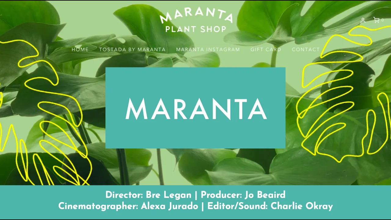
Maranta Plant Shop Documentary
Maranta is a short documentary exploring the founders, community, and collective joy behind Milwaukee’s first Black- and Brown-owned plant shop, Maranta, located in the Bronzeville neighborhood. The film centers the human stories at the heart of Maranta, weaving together entrepreneurship, family, place, and care through a slow, intentional narrative style.
What I Did
Pitched the documentary concept and led the project from vision to completion
Assembled and collaborated with a small production team
Directed the film and shaped the overall narrative arc
Conducted in-depth interviews with co-founders Michelle and Mag
Explored both professional motivations and personal histories to ground the story
Filmed on location at the shop, within the Bronzeville neighborhood, and at a co-founder’s family home

A Thousand Joys short, narrative-based video
A Thousand Joys
A Thousand Joys is a short-form documentary and visual storytelling project centered on the creative life of Joy, a jewelry maker based in Florence, Italy. The project captures her artistic process through an intimate narrative interview, paired with tactile studio footage and cinematic city scenes. Together, the video and photography offer a portrait of making, place, and devotion to craft.
What I Did
Concepted and directed a narrative video profile focused on Joy’s creative journey
Conducted an on-camera interview and shaped the emotional arc of the story
Filmed studio process footage highlighting tools, materials, and hands-on craft
Captured cinematic Florence city shots to situate the work within its environment
Photographed Joy in her studio and produced product photography for her Etsy shop and marketing use
Edited the final video with attention to pacing, tone, and emotional resonance
A selection of photos from Joy's studio and online catalog

AHS Emergency Fund Campaign Video
Hamilton Scholars Emergency Fund Campaign
The Alexander Hamilton Scholars Emergency Fund Campaign was a rapid-response, video-led fundraising effort created during the early months of the COVID-19 pandemic. I led the campaign end-to-end, developing an emotionally grounded narrative that centered Scholar voices and translated urgency into collective action.The campaign became the organization’s first video-focused fundraising initiative and resulted in record-setting engagement and impact.
What I Did
Collected and curated 30+ self-filmed video testimonials from Scholars and alumni
Edited a short, emotionally compelling appeal video that served as the campaign’s anchor
Built a donation landing page through Classy with clear goals and impact framing
Developed and executed a month-long communications plan across email, social media, and phone banking
Wrote weekly campaign emails, including a recurring “Medical Monday” series highlighting Scholars working in healthcare
Managed distribution across Facebook, Instagram, Twitter, YouTube, email, and the campaign landing page
AHS Emergency Fund Email Campaign example, "Medical Monday" email text with corresponding short video feature

AHS Emergency Fund Campaign Page Overview

UX & Digital Design
Great digital design is more than just text boxes on a website or pixels arranged in an aesthetically pleasing way. It’s about people, their goals, and the paths they take to get there.Whether it’s a website or an app, thoughtful UX (short for “user experience”) means:
clear information flow
intuitive navigation
experiences that understand users, not frustrate them
Research shows that well-designed digital experiences can significantly boost engagement and satisfaction. Users are more likely to stay on a site and engage with your services when navigation feels effortless and content feels tailored to their needs.
I approach digital work as a blend of strategy, empathy, and clarity-seeking: designing structures that support real human behavior, and interfaces that feel welcoming no matter who’s using them.Below you’ll find a few very different clients that reflect this approach.

Mountain and Moon Healing Website + Branding
Mountain and Moon Healing is a yoga and healing practice rooted in accessibility, embodiment, and care. I led this project end-to-end over the course of a season, partnering closely with the founder to develop a cohesive brand and digital presence that could support both new and returning students.The project began with brand identity and expanded into a fully custom website designed to function as a living hub for classes, meditations, and community connection.
What I Did
Designed the Mountain and Moon Healing logo and full brand identity
Created brand guidelines and social media templates
Designed and built the website from scratch
Structured the site’s information architecture and navigation
Integrated a live Google Calendar for monthly class schedules
Embedded Insight Timer meditations directly into the site
Designed a thorough, emotionally supportive FAQ structure
Illustrated custom design elements to provide visual hierarchy across the site
Shot branding photography, including class and headshot images
Click on an image below to scroll through the gallery at a larger size!


Images from the studio photoshoot for Mountain and Moon Healing

Milwaukee Bucks “Your Bucks” App
I participated in a technology bootcamp through the MKE Tech Hub Coalition, where interdisciplinary teams partnered with local organizations to design tech-forward solutions. I worked with the Milwaukee Bucks to explore how emerging technologies could deepen fan engagement.Together, my team designed Your Bucks, a mobile app concept featuring a fan loyalty program called Bucks Bux. The app leveraged machine learning to create personalized game-day recommendations, allowing fans to tailor their experience based on their interests, availability, and preferences.
What I Did
Led UX and visual design for the app experience
Designed the visual interface and interaction flows
Created app mockups and visual system
Helped guide team focus, collaboration, and decision-making
Contributed to project strategy and presentation for Demo Day
Click on an image below to scroll through the gallery at a larger size!


Images from the MKE Tech Hub Coalition's Demo Day, where teams were invited to present their projects to community partners.

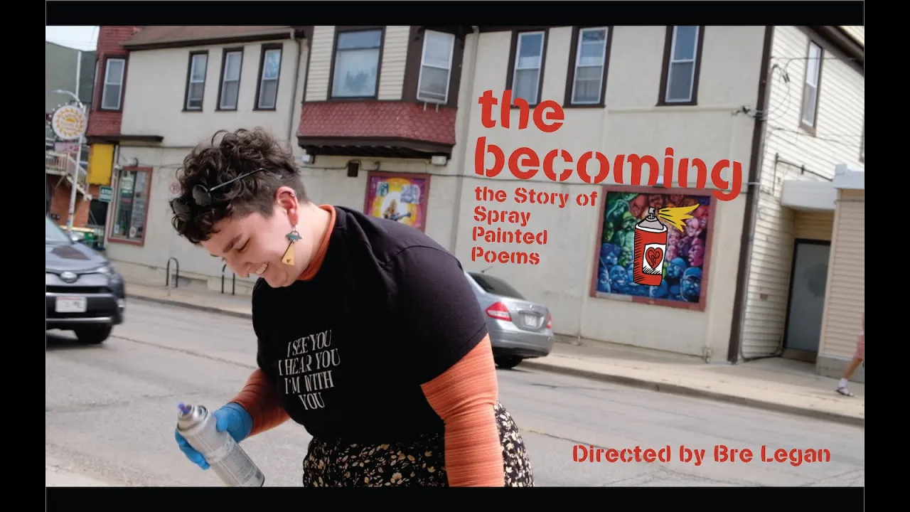
Spray Painted Poems Website + Design
Spray Painted Poems is a community-based poetry project that highlights local poets, businesses, and public spaces. I led the project from concept through execution, designing the brand, building the website, and creating multimedia storytelling to support a growing creative community.
What I Did
Brand identity and logo design
Website UX and build
Content structure for showcasing poets and partners
Embedded multimedia and interactive elements
Short documentary production
Click on an image below to scroll through the gallery at a larger size!


Documentary film filmed, edited, and produced in house about the project.
Ways We Can Work Together
I’m excited to welcome you on the journey of finding a designer to bring your ideas to life! For over a decade, I’ve been privileged to collaborate with values-aligned organizations, artists, and small businesses to create thoughtful, human-centered design and storytelling. Most projects don’t live neatly in one box–they overlap, grow, and become even better as we work together. The offerings below are meant to guide, not dictate, some of the possibilities!If you’re unsure where your project fits, that’s okay. We’ll figure it out together.
Branding & Visual Identity
For clients who want a visual presence that feels intentional, affirming, and alive.
Logo design and visual identity systems
Social media templates and launch assets
Brand guidelines and visual direction
Illustration and custom graphics
I’m especially drawn to working with folks who try to do good in the world. I love working with community-rooted organizations, musicians and artists, and businesses that are queer and trans led. Folks who want their visuals to reflect their values, not just their industry.
Editorial & Storytelling
For organizations and individuals who want to tell their story with depth and intention.
Interviews and long-form blog writing
Editorial layout and publication design
Narrative development for campaigns or platforms
Zines and printed storytelling projects
This work often centers people, process, and lived experience, especially within justice-oriented and community-based spaces.
Video & Multimedia Storytelling
For projects that benefit from movement, voice, and visual narrative.
Short documentary-style videos
Interviews and community spotlights
Campaign or educational videos
Small scale production and professional video editing
I’m most excited by video work that focuses on small businesses, nonprofits, and organizations doing meaningful work that brings unbridled joy and positivity into the world.
Web & Digital Experiences
For projects that need clarity, care, and structure across digital spaces.
Website design and build
UX strategy and information architecture
Content planning and copywriting
Integrating branding into functional digital systems
I approach web work as both a design and storytelling practice. My goal is to create projects that are accessible, easy to navigate, and feel human to the people using them.
How I Work
My process is collaborative and flexible. I value clear communication, mutual respect, and shared goals. I work best with clients who are open to conversation, iteration, and care for the people their work reaches.I aim to create work that is not only visually strong, but sustainable and useful long after a project ends. Sometimes this means I create a guidebook for how to best use your new designs, sometimes it means creating a virtual training so staff can make edits on their own after our contract is over. I truly want my work to work for you.
Accessibility & Care
I believe creative work should be accessible. I’m proud to offer sliding scale options, flexible scopes, and alternative approaches when possible, especially for small organizations and community-based projects.
Let’s Start a Conversation
If something here resonates, I’d love to hear about what you’re dreaming up. You don’t need a fully formed plan to reach out. A question, an idea, or a rough sketch is more than enough!
About Me
I’m a designer, writer, and storyteller working at the intersection of visual identity, digital experiences, and narrative. My work is rooted in care, curiosity, and the belief that thoughtful design can help people move from vision-driven ideas to meaningful, real-world action.I collaborate with values-aligned clients, especially queer, trans, healing-centered, and community-based organizations, to create brands, websites, editorial work, and multimedia projects that feel intentional and alive. I’m especially drawn to projects that blend strategy with softness and structure with story; work that is human.

How I Work
My practice is interdisciplinary by nature, and always has been. I believe that graphics, writing, and digital design can and should coexist. Whether I’m building a visual identity, designing a website, writing long-form editorial content, or shaping a multimedia campaign, I start by listening deeply and asking good questions.I care about clarity, accessibility, and sustainability. I want the things I help create to be useful, not just beautiful, and to serve people long after a project wraps.
Education & Experience
I hold a Bachelor of Arts (Summa Cum Laude) in Graphic Design, Photography, and Writing, with a Leadership Certificate, from Drury University in Springfield, Missouri. I also earned a Photography Certificate from Santa Reparata International School of Art in Florence, Italy, and a Grant Writing Certificate from Seattle Central College in Seattle, Washington.I completed a Master of Arts in Communication, with an emphasis in Digital Media Strategies and Economic and Social Justice, through the Trinity Fellowship at Marquette University in Milwaukee, Wisconsin. I was also honored to be the inaugural 2022–2023 Milwaukee Emerging Poet Fellow through Woodland Pattern Book Center.Over the years, I’ve worked across design, communications, and storytelling roles. I’ve conducted global communications work in Dharamsala, India, researched refugee advocacy in Rome, Italy, taught weaving as an adjunct professor in Missouri, served as the head of Marketing, Communications, and Development at an access-to-education nonprofit in Seattle, and directed creative strategy and design at a boutique justice-centric marketing firm in Milwaukee. These experiences continue to shape how I think about power, access, and responsibility in creative work.

Values & Throughlines
I was raised in a rural farming community of 700 people and can trace my farming lineage in that town back six generations (maybe more!). That sense of place, labor, and care for community deeply informs my work.I’m committed to creating affirming, thoughtful work for marginalized communities, particularly queer and trans folks. I believe design and storytelling should reduce harm, widen access, and help people feel more fully themselves.
Outside of Work
Outside of client work, I’m an artist and poet who loves zines, typewriters, old cameras, and tactile processes. You might catch me making strange things with fiber and found materials, writing fanfiction for a certain pirate show and hockey show, hiking whenever I can, and chasing moments of quiet magic in the everyday.I also possess a traveler’s heart! One of my early life goals was “21 countries by age 21,” and I somehow pulled it off (“30 by 30” as well!). That sense of curiosity and movement still guides how I approach both life and work. Check out my Substack blog, The Becoming Rambles, for more of my wandering writing and photography.
Let's Connect
If you’re interested in collaborating, learning more about my work, or just want to say hello, I’d love to hear from you. I aim to build creative relationships grounded in trust, respect, and shared values.
Contact Me
Interested in working together or have a question?
I’d love to hear from you!